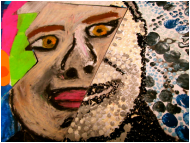
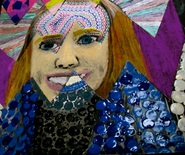
PROJECT ONE - Reflective Portraits
Students were given the opportunity to explore various NON-artist and/or non-traditional art materials to create various tones for their self portraits that reflected their characteristics. It was an interesting adventure as students considered the "properties" of the material they chose - did they really want people to see them as scratchy and abrasive or even misty and transparent? The students are discovering their artistic voice - enjoy their discoveries.
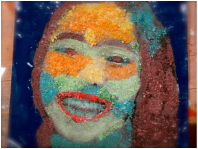
In this art piece Fruit Loops were used. At first I thought to use them as they are, but I then thought it would interesting if I smashed them up. I used a hammer to smash all the Fruit Loops after I sorted them all by color. In a face there are many different tones. By mixing colors it could create many different tones. The lightest tone was yellow and the darkest was purple. The lighting of the photo made my forehead lighter than the rest of my skin. Most of my skin is darker, so most of the colors are blue, green and purple. I didn’t want my teeth to be yellow because I thought it would look odd. Green and blue together are two of my favorite colors and they made a great combination.
For my background I painted it because I thought the paint strokes would really make everything in front pop. The paint is smooth and the cereal is more crunchy, so with the smooth background you could see the crunchiness of the Fruit Loops. The color I chose was a darker blue, I chose the darker blue because it contrasts well with all the bright vibrant colors. It can also show the two different ways people act. How everyone can be bright and happy, but to balance a person out you have a darker side to you.
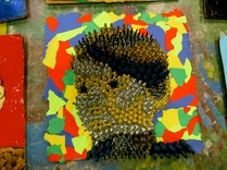
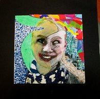
For my self-portrait I used different colored nails for my face. For my background I used different colored, ripped pieces of construction paper. My primary reason for using nails is because construction is in my blood. Both my dad and my grandpa have connections with the construction business. Although in the end my self portrait represents myself quite well. On the outside I’m bright and colorful, without much depth. On the other hand, on the inside I have a lot more depth than most know, it sounds tacky, but it’s true.
When you look at my self portrait many instantly assume I’m abrasive. In actuality I’m really not. The nails sticking out symbol my inability to get close with one. I'm cautious with others, as well as annoyed easily, therefore I am hard to befriend. Similar to before, many do not know this about me, hence the bright and colorful wallpaper.
When you look at my self portrait many instantly assume I’m abrasive. In actuality I’m really not. The nails sticking out symbol my inability to get close with one. I'm cautious with others, as well as annoyed easily, therefore I am hard to befriend. Similar to before, many do not know this about me, hence the bright and colorful wallpaper.
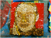
An array of shades, defined, yet thrown together into a being, a person. I am a platter of different layers, a little bit of everything. I have a sweet, sensitive side, but I also have a sarcastic, witty side. For this reason I choose a cereal for my material. The cereal I used contains almonds, corn flakes, granola, and pecans. It is a mix of different neutral tones. This represents the multiple aspects of my personality, and that each part is unique yet similar. I also choose the specific cereal I used because it is organic and I am against the artificial, photo-shopped culture of our society.
I would like the viewer to take away that I am natural, but not bland. I’m not nutty even though my material contains nuts. I do have a “crunchy” side sometimes. Most of all, I want the viewer to take away my distinct uniqueness.
I would like the viewer to take away that I am natural, but not bland. I’m not nutty even though my material contains nuts. I do have a “crunchy” side sometimes. Most of all, I want the viewer to take away my distinct uniqueness.
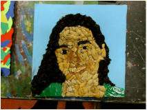
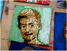
For my project, I chose nuts as my media. I used peanuts (every part; shell, nut and skin) for the light/medium tones and roasted hazelnut skins for a darker tone. I chose nuts because they have a very hearty flavor, defined in the dictionary as “wholesome and substantial”. Related to a person, hearty is defined as “loudly vigorous and cheerful”. I think that I am very loud and cheerful, therefore nuts and I share a common trait. That’s why I chose nuts. I used green and blue for my background colors, which for me represents my wish to be more connected with the earth. Nuts also have a very earthy flavor.
For the Viewer: Hey there! I want you take away that I’m a very hearty person (“loudly vigorous and cheerful”), and nuts are very hearty (“wholesome and substantial”). I chose nuts because they’re the heartiest thing I can think of. I chose blue and green for my non-nut colors because I feel that they’re very earthy colors, and I want to be a more earthy person. It’s one of my goals. Thank you for taking the time to think about my art!
For the Viewer: Hey there! I want you take away that I’m a very hearty person (“loudly vigorous and cheerful”), and nuts are very hearty (“wholesome and substantial”). I chose nuts because they’re the heartiest thing I can think of. I chose blue and green for my non-nut colors because I feel that they’re very earthy colors, and I want to be a more earthy person. It’s one of my goals. Thank you for taking the time to think about my art!
A bean, or legume, is one of the most basic, most hearty foods that is grown my man. Soybeans happen to be the second most produced crop in the country. I chose this media to represent myself, for two reasons. The first has to do with my being a vegetarian for a year, in 2014. Beans are a great source of protein for someone who does not eat meat. While I was a vegetarian, I got a lot of my protein from soybeans, garbanzo beans, and kidney beans. This is one of the reasons that I chose beans to make up my face in my self portrait.
The second reason, is that the idea of a bean seems to fit my personality, or at least part of it. I like to be in touch with the world around me, with nature. Crops that come straight from the ground are the ones I like to eat most, because I know they have not been tampered with by anyone but nature herself. I can relate to this because I try to be true to who I am, and not alter my personality because people tell me to.
For my background, I elected a green cray-pa shading, with silver glitter glue spread on top of it. Along with being a wholesome person, I am also a likeable person. I am happy, and so I wanted to choose something festive and bright. The silver and green look nice together.
I enjoyed this project because we were free to use any materials we wanted to, except for the “normal” artist’s materials. We were restricted, from being restricted. I enjoyed it. I also liked how up close, it is hard to tell who the portraits depict, but if you squint from afar, it comes clear. Sometimes you have to step back in real life too, in order to really appreciate something.
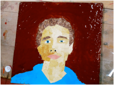
I decided to make my portrait out of magazine cuttings. I chose this material because I love to read. Every morning when I come downstairs for breakfast I will always read some sort of magazine while I eat. It is very easy to relax while eating and reading. I also chose magazine cuttings because they often have a sort of glossy look, and I feel that when I smile my face becomes kind of shiny. One thing that I think I did really well was using a sort of brown bush to create my hair. I was having a really hard time finding a suitable picture in the magazines I was looking at, and I think the brown bush really lets the viewer clearly see that my hair is very, very curly and messy when it's long.
I decided to paint my background because once again it gives a sort of glossy feel to the artwork. I chose the color brown because I think it contrasts nicely with the light colors I chose to use on my face. Another reason I chose to use lots of glossy elements is because they shine, and I'm a bright kid. I think the two main things that I want the viewer to take away from my artwork is that I love to read and that I'm bright.
I decided to paint my background because once again it gives a sort of glossy feel to the artwork. I chose the color brown because I think it contrasts nicely with the light colors I chose to use on my face. Another reason I chose to use lots of glossy elements is because they shine, and I'm a bright kid. I think the two main things that I want the viewer to take away from my artwork is that I love to read and that I'm bright.
My material for my portrait was glass and Sea Glass. Why I chose this material is because I love the ocean and have always collected sea glass since i was little. Also although my personality seems kind of see through/obvious (like glass,) I can sometimes have a harsh (sharp) personality. I used glass beads for my eyes and lips to create more precise lines. I painted my background a plain pink coral to let the bluish green tones of the glass stand out.
What I want my viewer to take from my artwork is how the textures look together honestly. I know this sounds a little basic or weird, but that’s personally my favorite part of the art. I think the smooth plain paint in the background looks kind of cool against the crazy tiling of the glass. I also think that the glass represents how my personality and life is sometimes unpredictable (the tiling is not a consistent pattern.)
What I want my viewer to take from my artwork is how the textures look together honestly. I know this sounds a little basic or weird, but that’s personally my favorite part of the art. I think the smooth plain paint in the background looks kind of cool against the crazy tiling of the glass. I also think that the glass represents how my personality and life is sometimes unpredictable (the tiling is not a consistent pattern.)
As you look at my picture it’s quite clear to see that the material I used for my portrait was crayons and that what I used for my background was paint. Although, the purpose of why I chose these items and what I want you to see when you look at my portrait might be unclear, so I have come to clear that up for you.
I chose crayons for two reasons actually, and both reasons stand as a clear representation of who I am as a human being. The first reason I chose crayons is the fact that they break easily. Just one bend and they crack in half, same way with me. I tend to crack under pressure easily, whether it’s a physical matter or emotional matter. The second reason I chose crayons is because they’re so colorful. I’m a really a bright and bubbly person when you get to know me, and the crayons simply represent another piece of my personality. I chose paint for the background, specifically because they’re so bright, again another piece to go with my bright and bubbly personality. The swirls basically represent my goofiness and just my personal happiness you could say.
When you look at my piece of art, I want you to see a girl who breaks easily under pressure, but at the same time see this fun, bright, bubbly girl with this wild- spirited personality.
There are many more rationales, but I can't post them all, but I found them to be insightful and a delight to read. Enjoy the remainder of the self portraits on the slideshow below.
PROJECT TWO - CONTRAST: A Lesson in Critical Thinking
Students were required to study a given photograph and research images from magazines to "fit" into the space of the photograph that would be in CONTRAST to its theme. Students were shown works by artist/photographer, Richard Renaldi and Mark Laita for exemplars. What is shown is small sampling.
PROJECT THREE
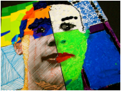
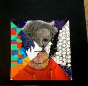
Executive Function
Self-portrait Two
What is an "Executive Function"? Are the eighth graders learning about politics in art? No. However, the lessons learned from this executive function task, are "life lessons". Executive Function has to do with time management, reasoning, flexibility, problem solving and more; and this lesson helps with this important thinking processes.
In art, the process is just as important as the product. (Egad! Did I admit that? Yes, I did! :-) Students had the task of creating another self portrait, however in four sections, using four different medium with the time restriction of completing each section in three days. The results are astounding! After the slideshow, please read the small sampling of student responses to rationale "questions". Your children did an awesome job.
In art, the process is just as important as the product. (Egad! Did I admit that? Yes, I did! :-) Students had the task of creating another self portrait, however in four sections, using four different medium with the time restriction of completing each section in three days. The results are astounding! After the slideshow, please read the small sampling of student responses to rationale "questions". Your children did an awesome job.
Student Thoughts on Executive Function
Overall this project was fun because I got to put my face together how I wanted to and use what I wanted to do in the areas I had. Following the sequence of techniques was a crucial part of the process because it was what made the project what it was and it helped me make my face with tones that I needed. Working as a “member” of the artistic process was a long process because my table mates sometimes distracted me from doing what I need to do. I found the drawing of the lines and pastels work to be interesting because of how I made my face choosing the different colors. If I had more time or could alter the project I would work more on the pastels because I need to add more tones to my face because my face was just on color. Sequencing and/or ordering is an important function because I will not be able to finish if I didn’t do it order. In comparison to my first portrait this newest portrait stands in contrast because this time I used artist materials and last time I used a non artist materials so it looked a little different. The line medium says the most about my face because it is the easiest to see my face and it looks the most like me. If given the opportunity to do a third portrait I would like to make my face out of one artist material and see what my face would look like as one thing. This project has helped me with time management because I had to complete each piece in 3 days and that helped me use my time well and not spend too much time on one part.
Overall, this project was very interesting because on the one hand we were restricted in terms of which materials we could use, but on the other we were free to use whichever colors and shapes we wanted. Following the sequence of techniques was crucial because, for the portrait to have the same mis- matched effect, it had to come together all at once at the end, with each piece worked on separately (Each piece becomes it’s own mini masterpiece). Working together with my table mates was important because we had to share the materials and space. I found Sydney’s art to be very interesting because of how it was unclear up close, but from a distance it clearly resembles her. If I could alter my own work, I would try to create that same effect.
In general, sequence is critical when doing art. An artist has to plan out their project before beginning, or else it may appear out of order. In comparison to the first portrait that I completed, in the first one tones were clearly evident, and the theme flowed easily throughout the piece. The second portrait had less tones, and it was harder to make the theme flow because of the inconsistent mediums. I feel that the paper medium says the most about me because of the cheery colors that complement each other. I try my best to balance all of my different colors (feelings/identities), and to have them complement each other. If I was given the opportunity to do a third portrait, I would like to try another 3D portrait, maybe a mask of sorts. I would choose this because I haven’t had a lot of experience with 3D art, and I want to see how it would turn out.
This project has helped me manage my time because of the 3-day time limit on each section. For some of the sections I could afford to really take my time with details. For others I had to limit myself to meet the time constraint. Overall, I learned a lot from this project. I learned about shades, time management, teamwork, and the different forms of art. In my portrait, I made each section to represent a different art form. The paper section was pop art, the dotted section was pointillism. Try to figure out what the other two represent!
- Overall this project was very enjoyable. I had a lot of fun utilizing different artistic mediums to create a very interesting portrait. I think my portrait turned out to my liking.
- Following the sequence of technique was a crucial part of the process because if you jumped from medium to medium you would get unorganized and would lose the artistic flow you had for each medium.
- Working as a “member” of of the artistic process was pretty smooth sailing because my table mates were very easy to work with and didn’t distract me too much. The only thing my table struggled with was distributing clean up time.
- I found Kimmy’s art to be interesting because she showed a lot of different emotions and themes through all of the elements that she used. For the paper part it was very light and happy, The chalk section was more dark and raw, the lines section were more orderly and almost “strict.” Finally the paint dots had more volume and texture.
- If I could alter the project I would probably change it so that we had less time to work on each section, because I didn’t need that long to finish each section.
- Sequencing is important because I will use it a lot in my daily life and in my future jobs and other aspects.
- This portrait stands in contrast to my other one because it has a lot of mediums as opposed to just one, and I think it's more interesting to look at than my other one. Also this one is more comical and happy in my opinion (the recent one,) because it has more color.
- The chalk lines medium says the most about me because it has many different patterns and colors that shows the different sides of my personality.
- If given the opportunity to do a third portrait I would do it of someone else I would do it of a friend or a celebrity (not of myself.)
- This project has helped me with time management, because it's taught me that I can still take my time, but be efficient and notice the time that I am using and be conscience of it.
- Overall, the project was pretty fun, but it was very limited with what you could do.
- Following the sequence of techniques was a crucial part of the process because we were focusing on the idea of tone
- Working as a “member” of the artistic process was easy because my table mates helped me when I was absent.
- I found Owen’s artwork to be interesting due to him adapting a mistake to his entire project to make more sense.
- If I had more time or could alter the project I would change the colors I used on the painted dots section.
- Sequencing and/or ordering is an important function because I will… (I personally don’t find sequencing important because you should do what you feel like doing at the time. I find whenever I’m drawing I switch in between what I’m doing depending on what part of it I want to do and it always turns out better than if I did one thing until it was done.) As you get older, you will realize that our lives are scheduled and operate within a “time frame” which is what usually keeps us moving forward. As far as the project, you were able to “switch” between mediums and techniques - it was merely scheduled.
- In comparison to my first portrait this newest portrait stands in contrast because I had more time to complete it and it was divided into four different styles
- The oil pastels medium says the most about me because it was the medium where I was able to control what I wanted to do with it the most. It was easy to use, and satisfying to complete.
- If given the opportunity to do a third portrait I would like to do more personally stylized artwork.
Perhaps you are more regimented than you think - which is why you move forward and not stagnate. Consider your classmates that did not finish, or those who had difficulty - why?
- Overall this project was enjoyable because we were able to experiment with new mediums.
- Following the sequence of techniques was a crucial part of the process because it kept us on track and help us manage our time.
- Working as a ¨member¨ of the artistic process was inspiring because my table mates helped me come up with ideas for my project and I could look at their work to give me an idea of what works well.
- I found Julia’s art work to be interesting due to her unique mix of color schemes and cut out of her sections.
- If I had more time or could alter the project I would make my face more proportional.
- Sequencing and/or ordering is an important function because it allowed me to make certain areas of my face pop and helped time management.
- In comparison to my first portrait this newest portrait stands in contrast because it has different tones and styles. This portrait was multi-media and the other was single.
- The paint medium says the most about me because the dots are colorful yet organized and show my personality.
- If given the opportunity to do a third portrait I would like to do an abstract portrait using watercolor.
- This project has helped me with time management because it forced me to schedule my time and think about when I would finish.
PROJECT FOUR - ICONS
Students were given the task of designing icons that represented self, family, school and a product. Students were encouraged to THINK - fast readability - they only have seconds to impress their viewer... This is what they came up with, hopefully, they will impress you.
PROJECT FIVE
Students were given objects that once upon a time were something, but dreamed of being something more, something different... So these students set upon the task of thinking outside of the box and began to RE-PURPOSE these items and what you see below is what they accomplished :-) A nice ending for our last rotation. Enjoy!
